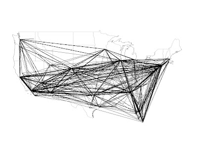
A byproduct of this is that the data I'm using to find out which airports are the busiest (the BTS Origin and Destination Survey) comes in origin-destination pairs, which I'm compiling to get the total number of airport users. But first, it offers me the chance to make my first maps with data!!!! I thought these were pretty cool, and they give me a chance to demonstrate my newfound prowress with Python graphics. First, an image of US flights in 2008:
 This shows the top 500 or so actual trips made by planes. The width of the lines is proportional to the number of passengers traveling between two given airports. You can see the importance of hubs like Atlanta, Denver, and Dallas-Fort Worth, which are all really busy even though the cities they serve aren't that large. I thought it was neat to see all the airlines in one place, as opposed to the in-flight magazines which only show hubs for one or two airlines. When flying on Northwest, you would get the impression that MSP, Detroit, and Memphis were the largest airports in the country, and while that obviously wasn't the case, it was sort of hard to compare with airports serving other airlines. Still, it's pretty much what you might expect if you travel a fair amount.
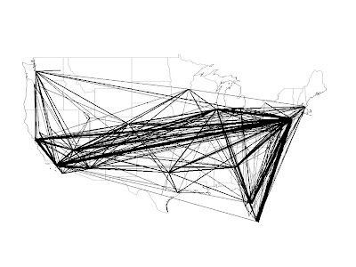
The other map I made was a little harder to predict:
 This one shows origin and destination pairs--where people are actually traveling to and from, not counting transfers. It only has the top 350 or so pairs, and I made a few changes to better illustrate some trends, mostly consolidating airports in cities with more than one, like New York and Chicago. You can see how different it is from the segments in the other map: it turns out that the main trend in US air travel is people going from the East Coast to Florida and the Southwest. It turns out that some of the busiest airports, like Atlanta, Dallas, and even Chicago to an extent, get most of their travel from people flying through them on their way to somewhere else. And whereas the flights give a fairly consistent net over most of the country (except Montana), the destinations are much more focused on the major centers of population and tourism.
Anyway, hopefully this info is interesting to other people. I know I had been curious about where people actually travel, and whether Atlanta really is that huge a destination. Now we know it's not, it's just the gateway to Florida (and most other places).
